Issues
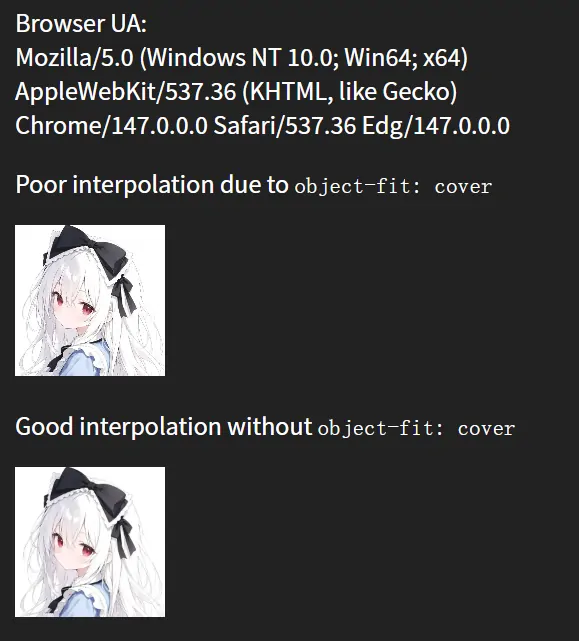
在更换网页的部分图片时,在部分图片需要尺寸重映射至更小的尺寸,例如使用object-fit: cover时,Chromium内核的浏览器(Chrome、Edge等)对图像进行缩放处理的默认行为导致图像在缩小后出现明显的锯齿状边缘,但通过手动指定width和height则貌似不会触发该现象,我在Firefox和手头安卓的webview上并没有复现相同的问题,这种现象似乎在高分辨率显示器上尤为明显。
[{"url":"https://oss.xenwayne.top/img/2026/05/eb14162fa11e90fd5aec1d30c3712367.webp","alt":""},{"url":"https://oss.xenwayne.top/img/2026/05/c771f833d2367c626a6212f3b5f4da15.webp","alt":""}]
引用站外地址
Poor interpolation demo
codepen.io
Chromium Issue 40230839记录了类似的问题,并附带一个复现demo。
引用站外地址
Chromium Issue 40230839
Object-fit: cover makes the image pixelated
我把原帖的复现demo稍加修改贴出来,如果此刻你正在使用Chromium内核的浏览器,在你点击下面的蓝色按钮时,你应当看到图片在被添加object-fit: cover属性后,出现焦外虚化尤其锐的现象。
Demo图片来自Unsplash,大小4.21MB,分辨率3456*5184,加载可能不畅。
Cause
首先搜到了kanochan在2023年的博客,看起来跟我遇到的问题完全一致,顺藤摸瓜又找到了相关的Chromium issue。
简单总结issue的讨论,该问题和Chrome的渲染引擎行为有关,Chrome 在使用 object-fit: cover 时,貌似禁用了 Mipmap 多级纹理过滤,强制使用原图线性采样,导致极端缩放下出现锯齿、糊、像素化。官方测试最早的Bad Build为Chromium 102.0.4961.0,相关提交Sharpen mipmaps with OOP-R。
本文写作时,该Issue的优先级为P2,直至2026年2月20日,该Issue仍在讨论。
Workaround
MDN文档提到了image-rendering属性,这个属性控制图片的渲染方式,但smooth这个值截至本文写作,仍为实验性特性,Chromium尚不支持,至于他对解决这个问题是否有帮助,只能放到将来讨论了。
1.StackOverFlow一个帖子提到,似乎可以在客户端层面关闭chrome://flags/#enable-gpu-rasterization (使用GPU光栅化图像)。
2.最简单也是最粗暴的办法,对于大小固定的场景,避免使用cover,转而设置固定的宽高值,亦或是在图片源文件上做文章,准备和容器尺寸一致的原图片,避免浏览器缩放图片。
3.经过我尝试,对img使用transform: translate3d(0, 0, 0) scale(1.0001)或者will-change: transform,可以消除该问题。究其原因,应该是transform相关属性触发了GPU渲染管线高质量重采样相关的逻辑,即使是will-change这种提前宣告的属性,也一样会触发相关逻辑,我准备了一个demo:
1
2
3
4
5
6
7
8
9
10
11
12
13
14
15
16
17
18
19
20
21
22
23
24
25
26
27
28
29
30
31
32
33
34
35
36
37
38
39
40
41
42
43
44
45
46
47
48
49
50
51
52
53
54
55
56
57
58
59
60
61
62
63
64
65
66
67
68
69
70
71
72
73
74
75
76
77
78
79
80
81
82
83
84
85
86
87
88
89
90
91
92
93
94
95
96
97
98
99
100
101
102
103
104
105
106
107
108
109
110
111
112
113
114
115
116
117
118
119
120
121
122
123
124
125
126
127
128
129
130
131
132
133
134
135
136
137
138
139
140
141
142
143
144
145
146
147
148
149
150
| <!DOCTYPE html>
<html lang="en">
<head>
<meta charset="UTF-8" />
<meta name="viewport" content="width=device-width, initial-scale=1.0" />
<title>Image rendering comparison</title>
<style>
* { margin: 0; padding: 0; box-sizing: border-box; }
html, body {
width: 100%;
height: 100%;
}
body {
background: #222;
color: white;
font-family: sans-serif;
display: flex;
flex-direction: column;
align-items: center;
justify-content: center;
padding: 10px;
}
#userAgent {
white-space: pre-wrap;
word-break: break-all;
font-size: 14px;
margin: 0 0 20px 0;
max-height: 100px;
overflow-y: auto;
scrollbar-width: none;
-ms-overflow-style: none;
}
#userAgent::-webkit-scrollbar {
display: none;
}
.comparison-row {
display: flex;
gap: 28px;
align-items: flex-end;
flex-wrap: wrap;
justify-content: center;
}
.comparison-item {
display: flex;
flex-direction: column;
align-items: center;
gap: 14px;
}
.label {
font-size: 16px;
text-align: center;
max-width: 150px;
}
code {
background: #333;
padding: 3px 8px;
border-radius: 4px;
font-size: 14px;
}
img {
width: 160px;
height: 160px;
}
.cover, .cover-fix, .cover-will-change {
height: 161px;
object-fit: cover;
}
.cover-fix {
transform: translate3d(0, 0, 0) scale(1.0001);
}
.cover-will-change {
will-change: transform;
}
@media (max-width: 700px) {
img {
width: 120px;
height: 120px;
}
.cover, .cover-fix, .cover-will-change {
height: 121px;
}
.comparison-row {
gap: 15px;
}
.comparison-item {
gap: 8px;
}
.label {
font-size: 12px;
max-width: 110px;
}
code {
font-size: 11px;
}
}
@media (max-width: 480px) {
img {
width: 90px;
height: 90px;
}
.cover, .cover-fix, .cover-will-change {
height: 91px;
}
.comparison-row {
gap: 10px;
}
.comparison-item {
gap: 6px;
}
.label {
font-size: 10px;
max-width: 90px;
}
code {
font-size: 9px;
padding: 1px 4px;
}
body {
padding: 8px;
}
}
</style>
</head>
<body>
<div id="userAgent"></div>
<div class="comparison-row">
<div class="comparison-item">
<div class="label">Poor: </br><code>object-fit: cover</code></div>
<img class="cover" src="https://gcore.jsdelivr.net/gh/XenWayne/sitefile/img/avatar.webp" />
</div>
<div class="comparison-item">
<div class="label">Good: </br>no <code>object-fit</code></div>
<img src="https://gcore.jsdelivr.net/gh/XenWayne/sitefile/img/avatar.webp" />
</div>
<div class="comparison-item">
<div class="label">Fixed: </br><code>translate3d(0,0,0) scale(1.0001)</code></div>
<img class="cover-fix" src="https://gcore.jsdelivr.net/gh/XenWayne/sitefile/img/avatar.webp" />
</div>
<div class="comparison-item">
<div class="label">Fixed: </br><code>will-change</code></div>
<img class="cover-will-change" src="https://gcore.jsdelivr.net/gh/XenWayne/sitefile/img/avatar.webp" />
</div>
</div>
<script>
document.getElementById("userAgent").textContent = navigator.userAgent.replaceAll(") ", ')\n');
</script>
</body>
</html>
|
Reference
引用站外地址
Chromium Issue 40230839
Object-fit: cover makes the image pixelated
引用站外地址
Chromium Issue 40258544
background-size: cover caused pixelated image
引用站外地址
关于CSS缩小图像会产生锯齿的原因探讨
KanoChan の VERSE
引用站外地址
CSS image-rendering 属性
MDN Web Docs
引用站外地址
Google Chrome images distorted & pixelated after latest update for some (workarounds inside)
piunikaweb
 wechat